Team: Fei Gao, Yujin Su, Darshil Mehta
Tools: Sketch, Quicktime
Topic: Usability Evaluation Methods
Overview
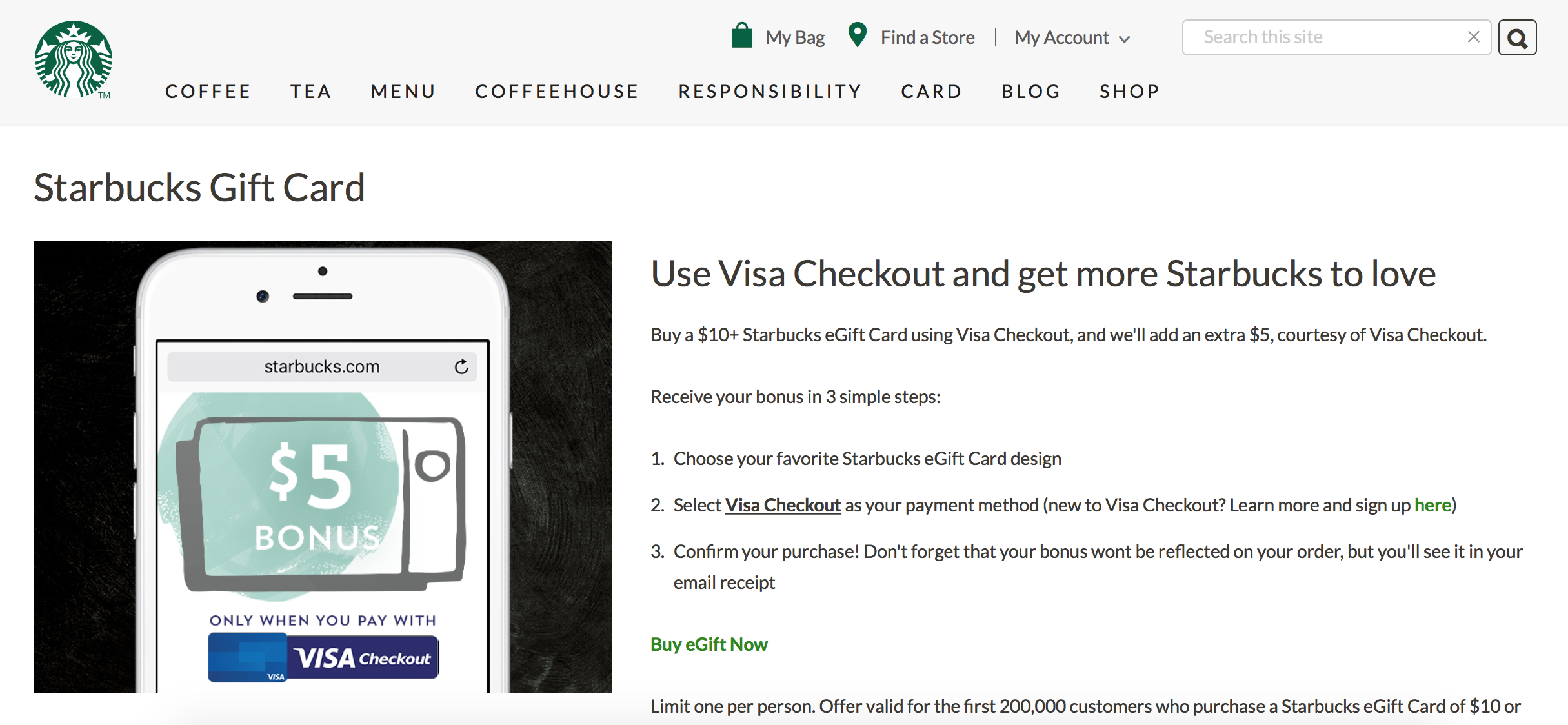
The Starbucks.com serves as an online extension of Starbucks’s offline business.
Users can buy coffee, view menus and apply/manage their Starbucks cards on this website.
While it provides various functions and aims to make consumers' shopping experience more comfortable,
it suffers from numerous poor designs.
With the purpose of finding out critical design issues, we did the following in this project:
Expert Inspections
While we had two choices when performing expert inspections -- heuristics evaluation and cognitive walkthrough -- we finally chose to use heuristics evaluation
because the feature of Card Management actually has two main pages in Starbucks.com, as shown in the pictures below. Heuristics evaluation is not task-specific and
can provide a broad examination of the system.
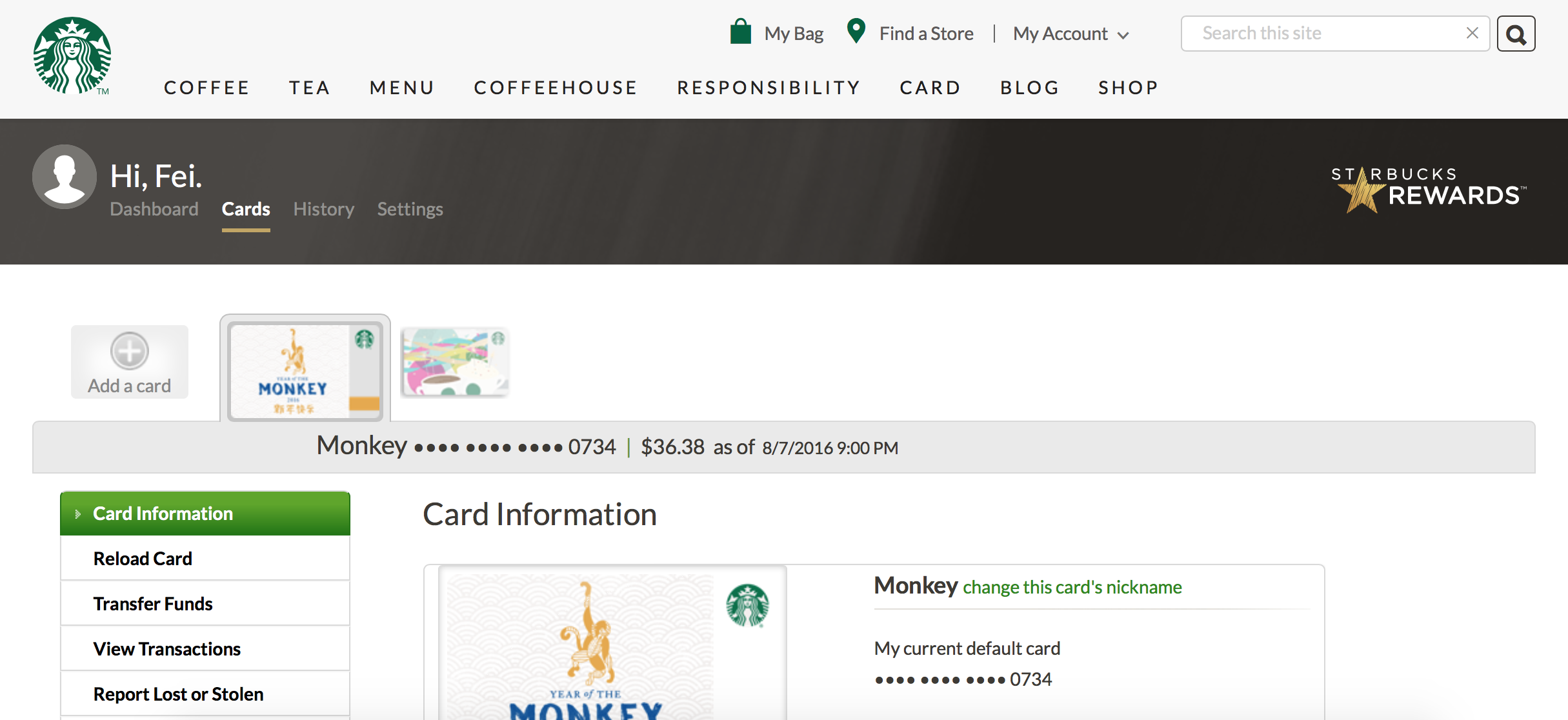
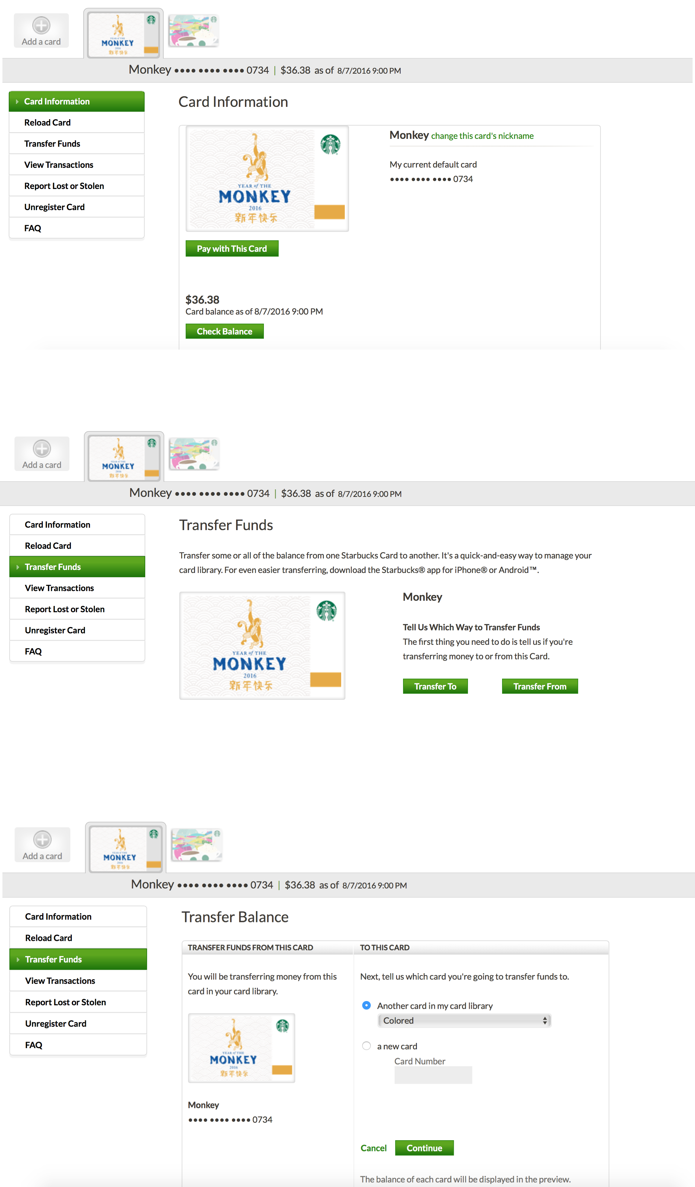
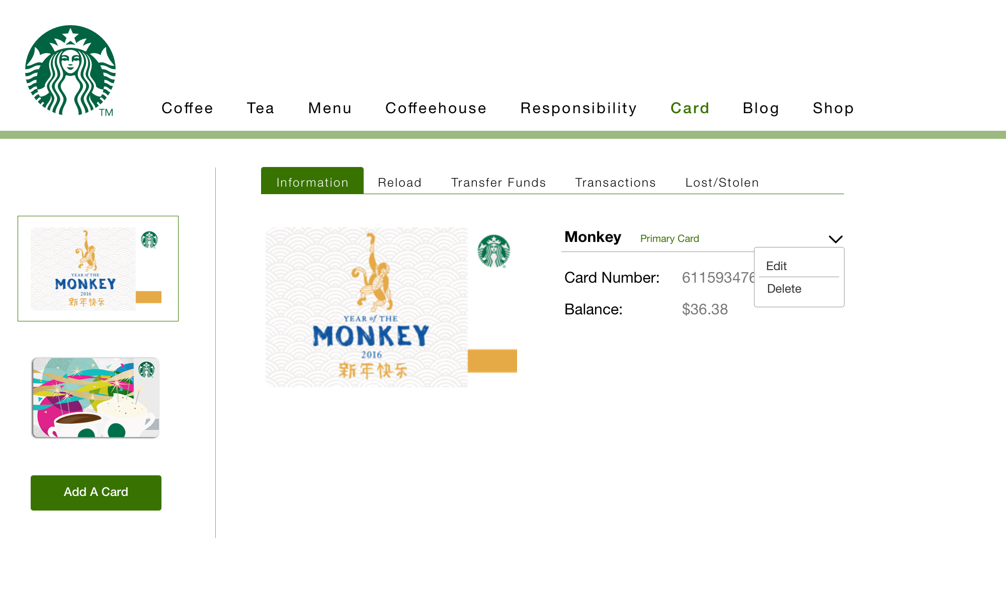
Users can operate their cards after they click the "Card" link on the global navigation.
The main card management feature is in this dashboard
Heuristics Evaluation - Fei
Heuristics Evaluation - Yujin
Heuristics Evaluation - Darshil
Pilot Test
After expert inspection, we began to prepare for our pilot test. We narrowed down our test scope and focused on the card dashboard page because based on heuristics evaluation, while the two pages
both have usability problems, the key features on the card dashboard are the most serious.
In the pilot test plan, we mainly wanted to see navigation problems and the usability issues on transferring funds, as you can see in our test tasks. However, it turned out that in the pilot test
the user really encountered very little navigation problems. While we also wanted to test the position of the "Add A Card" button, our task related to this objective is not specific enough, we allowed user to choose
another way to add a card instead of using the button that we wanted to test, as a result we did not gain any feedback on what we wanted to test.
In the test plan, we listed everyone's role carefully, we also had a detailed test script which guided us through the whole test smoothly. When preparing the test, we referred to our checklist
to do the settings. We found all these contents quite helpful and retained them in our final test plan.
Test Plan for Pilot Test
Usability Evaluation
The pilot test provided valuable information and we modified our original test plan accordingly. For the test objectives, we shifted our focus away from the navigation to
a broder scope including "Add A Card" feature, instruction texts, transferring funds, and "Unregister" / "Remove" cards. The number of tasks is reduced, but the questions are more specific,
for example, as mentioned above, we wanted to test the "Add A Card" button in "Card" dashboard, this time we asked users to add two cards, while they have several ways to add the first card,
the only way to add a second one is through the button that we wanted to test.
An overall change is listed below, for detailed explaination, please refer to the test plan.
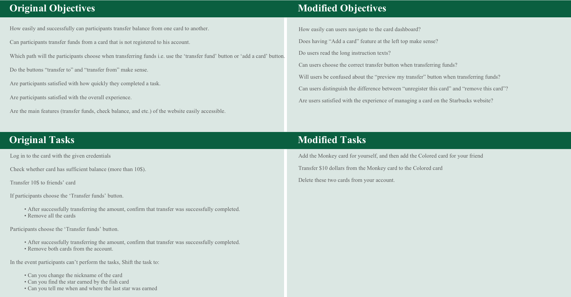
We believe the modified objectives are more specific and easier to observe. The modified tasks will also better address our test objectives.
With this new test plan, we began to test real participants. We recruited 6 participants in total, the participants range from students to professionals, all of which have rich experience on Internet but are unfamiliar with Starbucks.com.
Starbucks.com Usability Evaluation Test Plan
Evaluation Results
There are 5 major findings in our test:
- Finding 1: The position and style of “Add A Card” button makes it difficult for users to recognize
- Finding 2: People have different understanding of “Transfer To” and “Transfer From” button, they will not read the instructional texts either, thus many users will make mistakes when choosing the correct transfer button.
- Finding 3: While people seldom make mistake on preview page, it could be redesigned to be more intuitive
- Finding 4: It makes no sense to express the deleting a card function in two ways.
- Finding 5: It’s difficult to find the field for changing transfer value.
Starbucks.com Usability Evaluation Report
Redesign
We used Sketch to mockup some redesign ideas. According to our findings and recommendations, our points of redesign is listed like below:
- Redesigned the layout of the "Card Management" page so that the button of "Add A Card" could be more accessible. (Finding 1)
- Completely redesigned the "Transfer Funds" feature. (Finding 2, Finding 3, Finding 5)
- Hid the feature of "Editting" and "Deleting a card" under the "Card Information" tab, the redesign includes no distinguishment between "Unregister a card" and "Remove a card" (Finding 4)
The redesigned pages
KLM Analysis
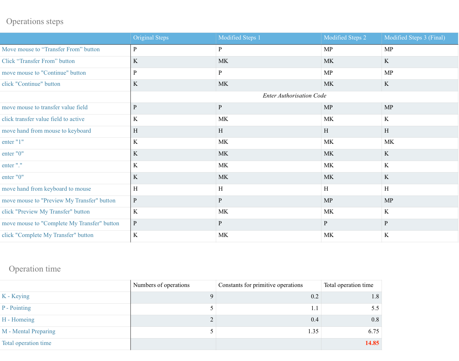
We finally conducted KLM (Keystroke level model) analysis for both the original website and the redesigned. The task is "Transfer 10 dollars from the 'Monkey' card to the 'Colored' card". During the analysis,
we omitted the steps of entering the authentication cade because for both websites users will spend the same time on this step (theoretically). Based on the same reason, we also omitted the the "M"(Mental Preparation) and "R" (System Response time) in KLM.
Original website:
Redesigned website:
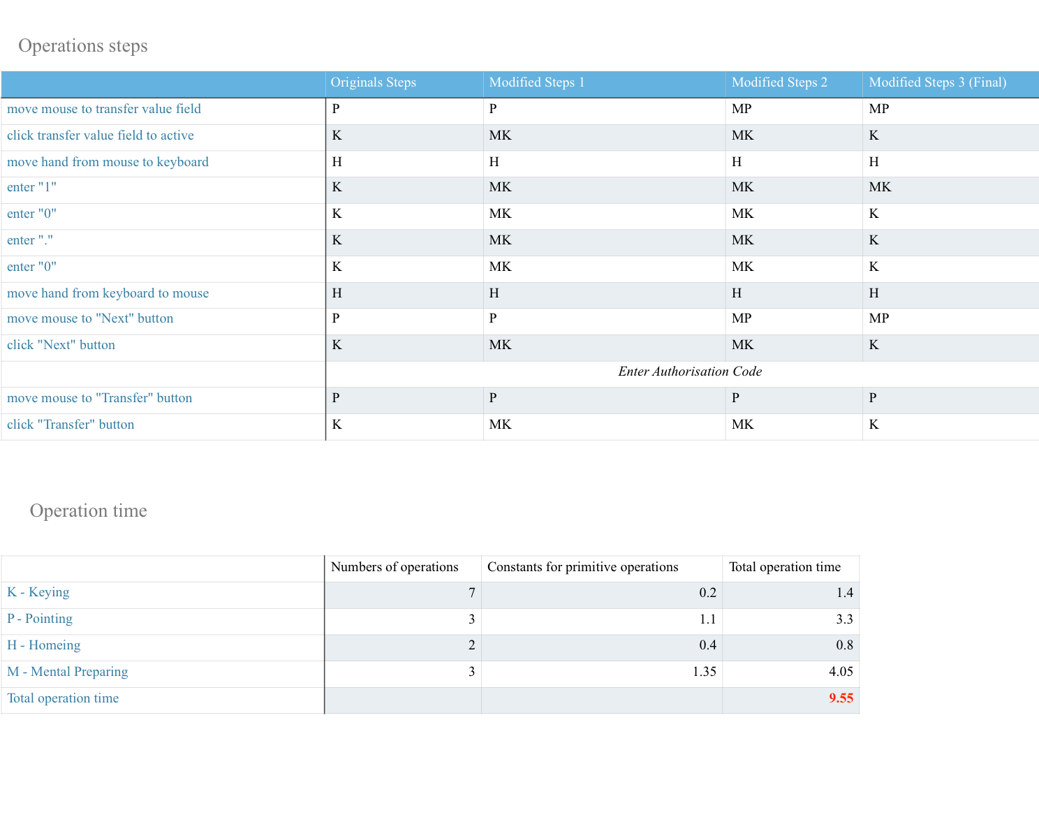
The final result means: For an expert users of Starbucks.com, when transferring 10 dollars from one card to another, theoretically he'll spend 14.85 seconds on the original website and 9.55 seconds on the redesigned one, excluding the time of entering the authentication code, his mental preparation and system response time.
This result shows clearly that the redesign has reduced one third of the total time, helping users to transfer funds much more efficiently.